Climate Chronicles

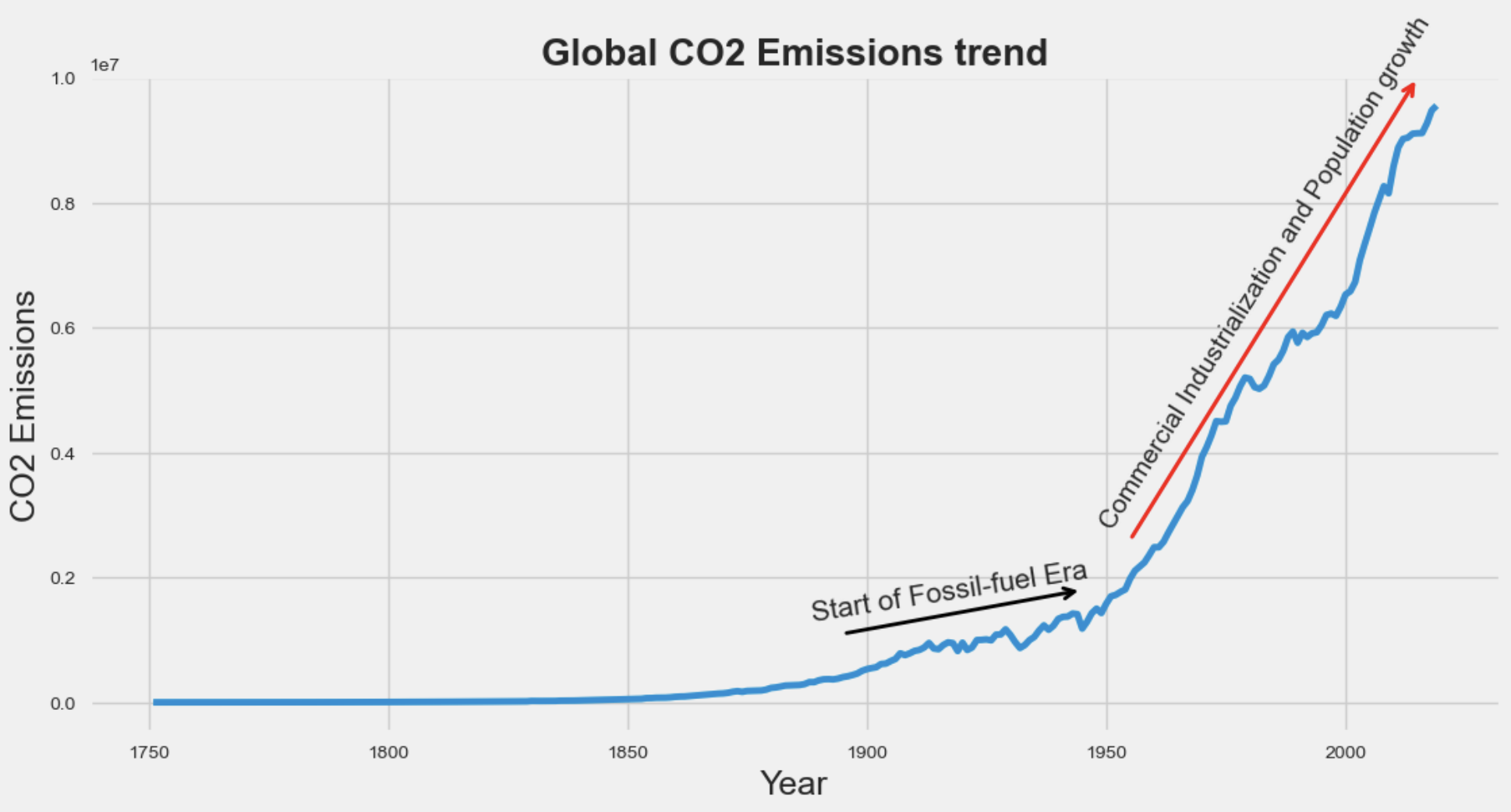
The Ascent of Global CO2 Emissions

The image is a graphical representation of the historical trend of global carbon dioxide (CO2) emissions from the late 18th century to the early 21st century. In fig 1., a line graph shows a relatively flat line of emissions from around 1750 until the early 1900s, indicating low levels of CO2 emissions during this period. Thereafter, the line begins to ascend, with a noticeable increase starting in the early 20th century. The graph then shows a steep incline from around the 1950s onwards, with the line becoming almost vertical as it approaches the 2000s, reflecting a dramatic surge in emissions during this time. such as the start of the fossil-fuel era and the period of commercial industrialization and population growth. These periods are crucial to understanding the relationship between human industrial activity and the increase in CO2 emissions, which is a significant driver of climate change.

 
Description of the image
Fig 1. Historical CO2 Emissions Trend - A graphic depicting the rise in global carbon emissions from 1750 to the present day, highlighting the impact of industrialization and population growth on climate change.

Total emissions Versus Per-Capita CO2 Emissions Among top 5 emitters from 1950-2019

Fig 2. shows two line graphs comparing the total carbon emissions and per-capita CO2 emissions of the top five emitting countries from 1990 to 2020. The fig 2a. displays the total emissions, with China's steep rise reflecting rapid economic and population growth. fig 2b. shows emissions with respect to per capita income, revealing a different trend: the U.S. leads, indicating higher individual consumption despite a smaller population. The divergence in trends between the two graphs highlights the impact of population size and economic activity on country emissions.

 
Description of the image
Fig 2a. A Comparative Analysis of Total CO2 Emissions by top 5 Countries from 1990 to 2020" &   Fig 2b. "Per-Capita CO2 Emissions Trends Among Top 5 Polluting Nations from 1990 to 2020"

Carbon Emission over time

Fig 3. shows a choropleth map to visually represent CO2 emissions for countries worldwide, from the years 1950 to 2019 with a range of interactive features, including zoom and pan capabilities, helping users to delve into specific areas with close-up views or gain a broader perspective by zooming out. Additionally, we have integrated an Detail-on-Demand interactivity approach, allowing users to effortlessly access detailed information about a particular location by hovering their mouse over it. This information shows the nation's name and corresponding CO2 emissions data. These featues will aid users with an intuitive and insightful experience as they explore and analyze global carbon emissions trends over the years.