Climate Chronicles

Reference 1

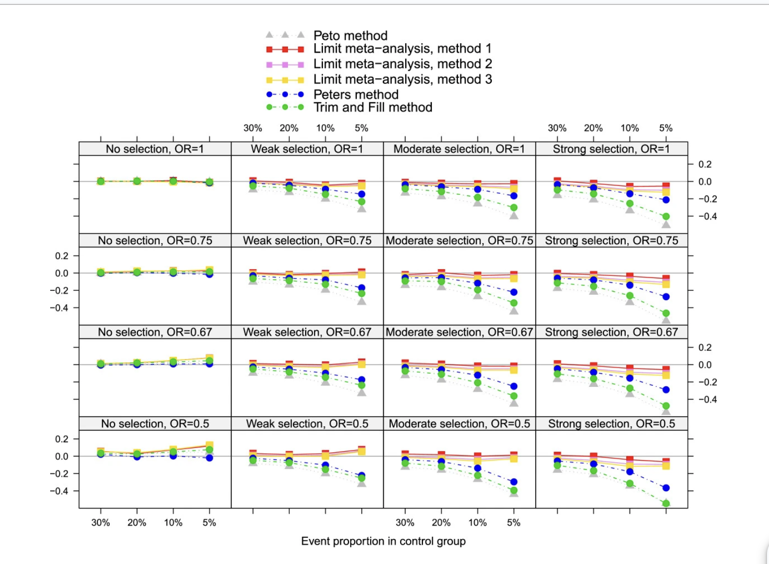
This research paper [1] is a methodological study on how statisticians, when developing new statistical methods and subsequently evaluating their characteristics by applying various variables in simulation, can appropriately present the results. In this paper, trellis plots, which are also known as small multiples from the lecture, are intentionally used as a good method to present all results at once. Our group has also constructed visualization applying small multiples with the same intention, so I want to refer to the plots in this paper. The small multiples in this paper contains a total of 16 sub-plots in a large plot, which are organized based on the variables in both columns and rows. Therefore, the positions of the 16 plots are determined by the x-axis and y-axis of the large plot, and even without detailed knowledge of the paper contents and its plots, the user can intuitively perceive a flow connected between the plots. Our group’s small multiples about sea level rise contain 24 different ocean’s sea level rise plots, and they are placed almost randomly in a 4 by 6 table format. However, I expect that if these plots are arranged under specific conditions that are informed by labeling on the plots, then users would more easily understand information about global ocean sea level rise. As an example of specific conditions, there could be an arrangement based on the actual locations on the map. Although there might be differences between the places on the table-formatted plot (small multiples) and the actual locations, if the ocean areas are placed to the actual closest ocean area in the small multiples, it would make the plot more reasonable to understand the flow of sea level changes in the world oceans. This approach might also make it easier to identify which ocean is undergoing more significant rising and, conversely, which ocean is experiencing less impact from sea level rise.

 
Description of the image
Figure 1. The small multiples with 16 line subplots; it shows how small multiple plots, which include many subplots, are arranged and organized.

Reference 2

The given source visualization and our dataset are the same. The way they used these data to aggregate latitude and longitudes into a grid(box) and use the mean of those grouped data points to represent anomalies at that region. As the user is not anyway interested to know about the temperature anomaly at lat X, Long Y. By using this kind of representation the Users can know zonal temperature anomalies. And could be more easy to understand. But this representation is only for one year. In our project we tried to implement a similar type of visualization with representing in grids and animation of anomalies over the years.rendering this huge amount of data with an impressive choice of marks and channels is challenging . so we used the lat, long points data and made our visualizations look smooth or regional rather than pointed data. And this visualization has a lot of user-friendly options to navigate the map to the desired month and years.In our visualization the world map is flatten like a paper, the provided source they have used a spherical shaped map which is good and makes the user feel working of 3D visualization.

 
Description of the image
Figure 2. The heatmap with grid lines on 3D shape of the world map for temperature anomalies; this helped establish the basic concepts on how to effectively convey information about global temperature.

Reference 3

This choropleth map bears similarity to the CO2 emissions choropleth map that we have in our project. While our project visualizes data for 2020, this map showcases emission data from 1750 until 2021 providing users with a broader understanding of trends over time. This choropleth map uses shades of orange and brown to represent different levels of CO2 emissions, with darker shades indicating higher emissions making it better than the one in our project, which used a diverging scale to represent decreases and increases. This map also uses a quantitative scale at the bottom to indicate absolute Co2 emissions in tons rather than the percentage scale we used in our map, presenting the data in a more direct form, showing the actual quantities of emissions, which can be more informative for understanding the hierarchy of emissions per country. Adding a time-lapse animation feature to the choropleth map enhanced the user experience allowing users to view the CO2 emissions over time. This feature helped to demonstrate trends and patterns that may not be immediately apparent from the static data in our project. Additionally, areas with “No Data” are marked distinctly, crucial for data accuracy and transparency. Overall, this choropleth map’s design choices offer a more immediate and precise understanding of CO2 emissions, a more intuitive user experience, and a potentially more precise and informative way for the users to engage with the data.

 
Description of the image
Figure 3. The choropleth map for CO2 emissions over time with detail on demand features

Reference 4

This visualization and the other variations present in the article attempt to solve the issue present in other similar visualizations, which is that they can only encode one variable at a time. To solve that issue, it creates a self-organizing map (SOM - top right) and a parallel coordinate plot (PCP - bottom left and bottom right), which are able to project multivariate data onto a 2D space [4]. There is also a map that shows an alternate view of the data. This relates to our project because both our and this article attempt to solve problems with other similar visualizations. For example, one of our main goals for this project is to create a temperature visualization that uses color better, especially in regards to the legend. This article also includes a map as a prominent idiom, which we also used as one of our artifacts for the Alpha and Beta release. Compared to Fig 2.()The heatmap with grid lines on 3D shape of the world map for temperature anomalies; this helped establish the basic concepts on how to effectively convey information about global temperature. and Figure 3.(The choropleth map for CO2 emissions over time with detail on demand features), the choropleth map is a lot more complex, mainly because it attempts to encode multivariate data. Due to its complexity, it becomes much more difficult to read, and as a result alienates a significant amount of readers. That directly contradicts our goal to make a visualization for the general population. As a result, this related work also serves as a word of caution to ensure that we do not make a visualization that becomes so complex that it alienates our intended users.

 
Description of the image
Figure 4. Comlex visualization; when attempting to convey all information while visualizing a large amount of data, it can become complicated. Complex visualizations can actually hinder the effectiveness of representing information.

Reference 5

The above research paper analyzes how the CO2 emissions correlate with rising global temperatures and sea levels, utilizing multi member ensemble simulations from two climate models, PCM and CCSM3, to quantify future warming and sea level rise under varied CO2 scenarios. In our project, we've created correlation maps similar to these, such as time series visualizations showing the percentage correlation between global sea-level and temperature rise, and between equatorial temperatures and those of adjacent regions. Unlike the referenced study, our project does not extrapolate trends or make forecasts related to CO2 emissions or future sea-level changes. This paper also contains the usage of choropleth maps that depict projected regional surface temperature changes for three future scenarios (B1, A1B, A2) and a stabilization case, comparing late 21st-century predictions from two climate models against a late 20th-century baseline even though it is out of our reference range in our current project. But, similar to Figure 1. (approach using small multiples for sea-level data), our current reference employs correlation techniques to link attributes like CO2, sea-level, and temperature (both regional and global), offering subtle insights into time-series data with multifaceted parameters and diverse attributes.

 
Description of the image
Fig 5. A subplots of carbon emissions & temperatures & Sea levels with different measuring scales trying to visualize the co-relation among them